Musings on User Interfaces

It’s interesting to read how different people are reacting to the user interface changes (“improvements?”) in Leopard, which got released today. It’s probably premature to say how opinion will ultimately shake out. But I’ve started to collect some noteworthy opinions.

Also concerning user interfaces: Mozilla Prism has been announced. It’s a project which extends the existing browser platform of established web standards in order to run as desktop applications. The description is light on details and implementation, but several comments on the announcement already express skepticism.

Ian Bicking is clearly excited about it (I actually found the announcement through his truly wonderful blog). He sees Prism as embracing the essence of the web model. The key, I think, is whether the extensions will be rich enough: will there be ways to access local storage, control security, and access devices? Without those changes, I’m not sure the desktop app “frame” around the web application buys all that much. Some underlying functionality needs to accompany the desktop interface in order to be really transformative.
Bad user interface! Bad! Bad!

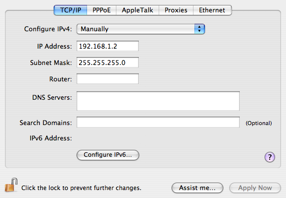
Changing options under the System Preferences panel for Mac OS typically takes effect immediately. Unlike Windows, there are no standard “OK” and “Cancel” buttons. That’s cool… it’s simpler and more intuitive that when you change something, well, it should just change.

Except when there’s a complicated panel that actually does have an “OK”-type button. Like Network settings, for example. If I have a static IP address, the window looks like this:

network_scr1.png

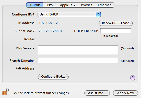
Now, when I pull down the “Configure IPv4” selector and change it to “Using DHCP,” the panel immediately changes to look like this:

network_scr2.png

At this point, I always click “Renew DHCP Lease” to get a new address. I mean, it’s right there–so close to what I just changed.

But it doesn’t work. It grays out for two seconds, then becomes active again. The old address remains, unchanged. I’m fooled into thinking something is wrong with my network cable, or the network configuration is amiss elsewhere. I troubleshoot, and click and click, like an idiot…. until I realize I have to hit “Apply Now” at the bottom, before DHCP even takes effect.

Now, I’ll be the first to confess I’m no UI genius. I can make basic, clean-looking interfaces, but I make sure to get help when I need a solid UI for a complex workflow. But even with my impoverished sensibilities, I can spot the simple fix here that would save a great deal of anguish and wasted time for potentially frustrated Mac users everywhere. Don’t show a damned button unless it does something. Or at least gray it out until it’s ready to be clicked.

Sheesh.