 Life under this pandemic has been hard. Oddly, one of the things that’s helped me deal is to play around with the coronavirus data. The numbers in the U.S. are horrifying, of course, but they’ve also been soothing at a technical level, maybe because working with the data is somewhat different from the work I do for my job. It’s also been neat to do hands-on validation of reporting in the media and various claims made about trends. I’ve been showing my results to friends who seem to find them insightful.
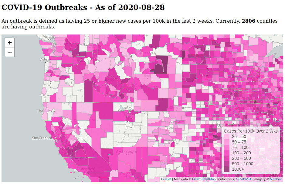
The repository is here. There are links in the README to the charts and visualizations.
Some technical reflections on this little hobby project:
I used Python and SQLite. Apache Spark seemed like overkill and I haven’t spent enough time with Spark to be able to troubleshoot intermediate pipeline steps as easily as I can in a plain SQL database. SQLite is fantastic for doing ETL or ELT. I can’t recommend it enough for non-“big data” scenarios. It’s fast (if you use local disk access), has enough SQL features for most ELT/ETL work, and is well-suited for use by a single user. It’s also good if the end goal is to produce data that will ultimately get imported into another system, say, a full-fledged RDBMS data warehouse that serves multiple users.
Currently, with just over 5 months of county- and state-level data, it takes ~2 minutes to to load all the raw data, transform it into dimensional tables that calculate various measures, and create data files used by the web pages that display tables and charts. The SQLite file is 850 MB which includes a lot of stage tables. This is on my laptop with a i5-7300U processor. Not too bad.
I created a Makefile to handle dependencies in the data pipeline, so that it only re-runs parts as needed. It’s currently not as fine-grained as it could be. For example, any change in the JHU CSSE data files will reload ALL the files into the database, but that portion of the code takes only maybe 10s total anyway. Similarly, all the dimensional models are created in a single process and could be split out. I’m happy with how it turned out overall with the qualification that writing and maintaining the Makefile is a bit of a pain. I might try using Apache Airflow instead at some point.
Storing data files in a git repo feels gross. But I did this so the chart and map web pages served through GitHub Pages could load the static data files. It’s a simple and free hosting solution.
In general, I like how simple this setup turned out to be and how easy it’s been to add new measures or tweak existing ones.
EDIT: In November 2020, I switched to using BigQuery.